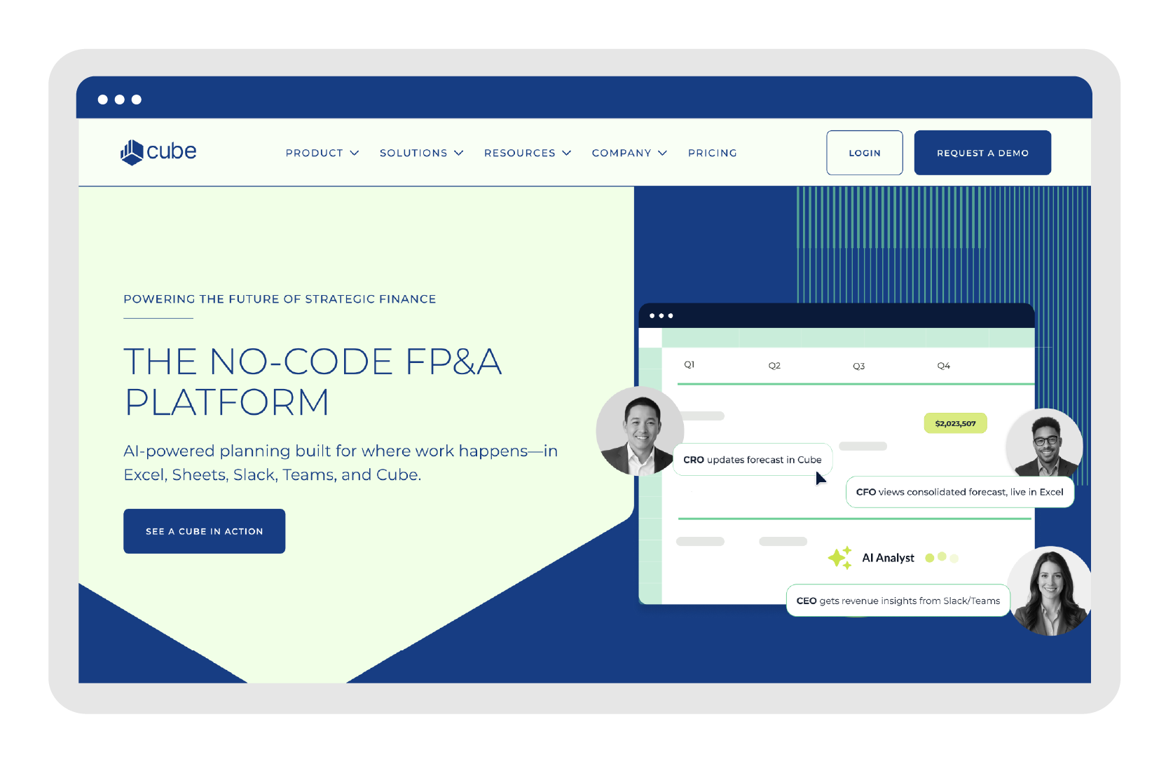
As Cube’s sole Brand Designer, I worked on designing across a complex SaaS product used by finance teams for planning, forecasting, and reporting.
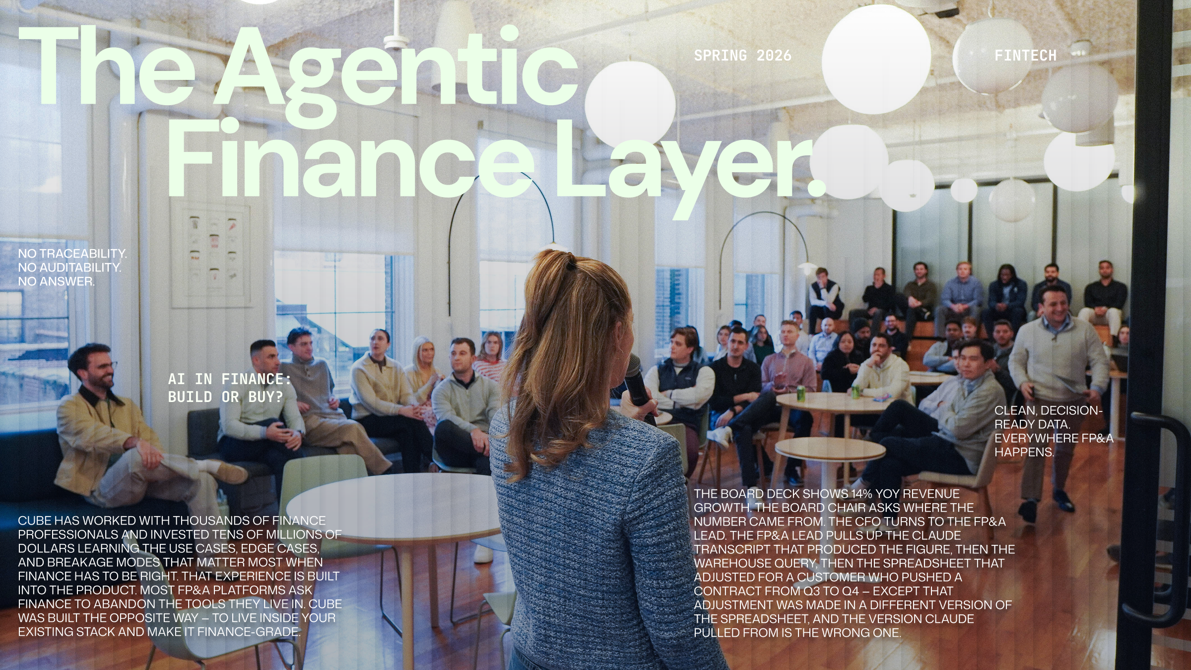
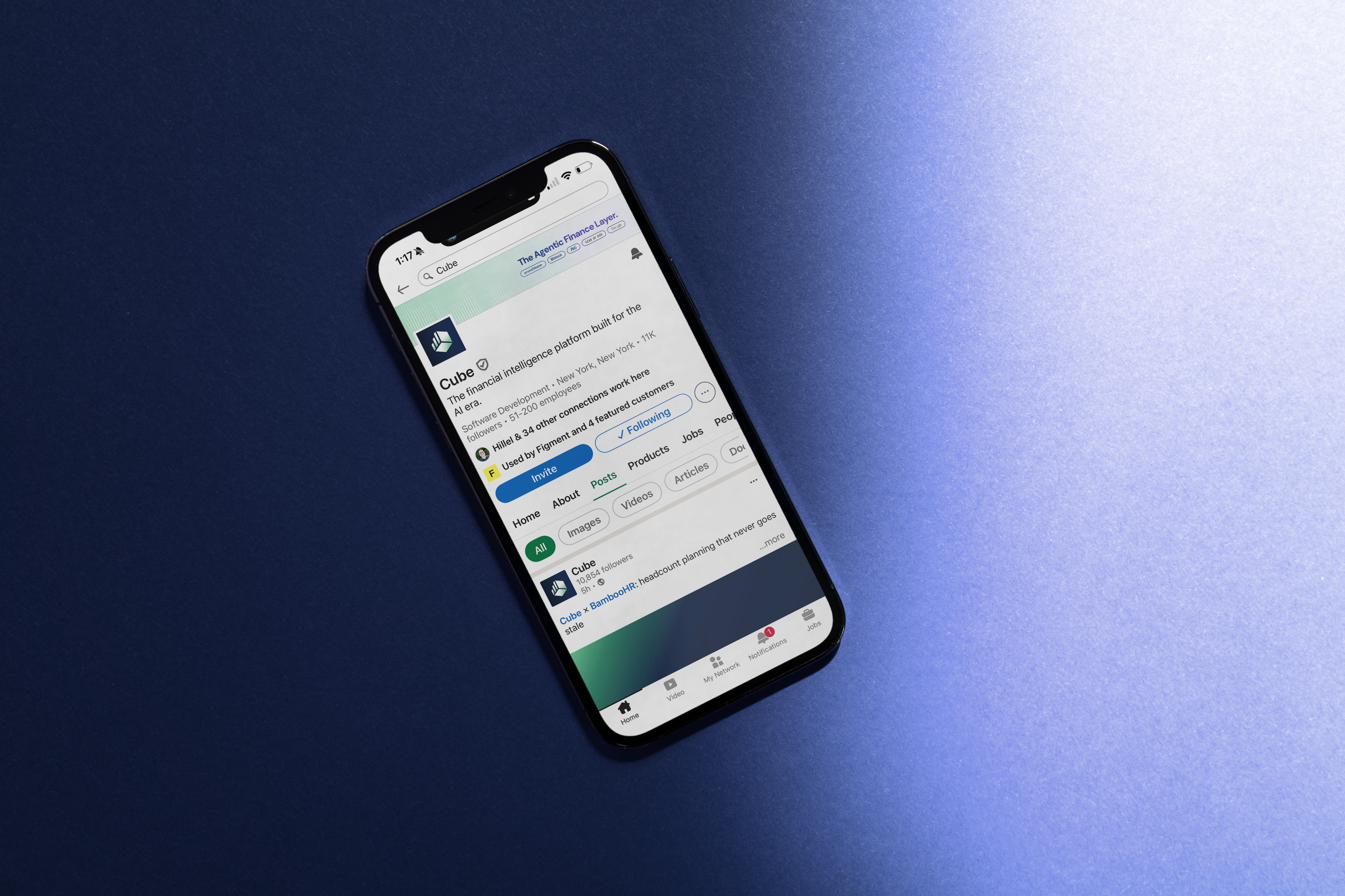
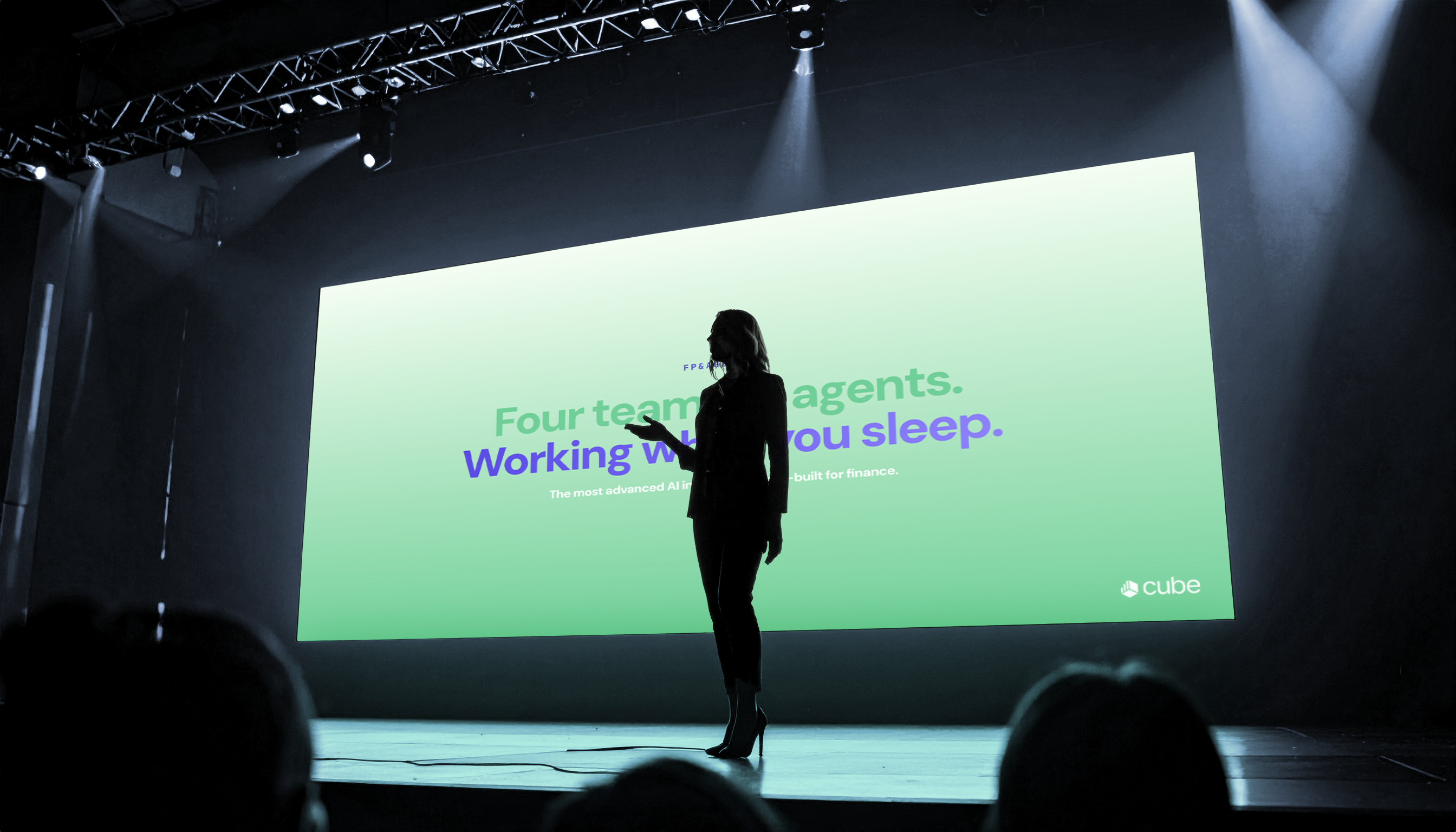
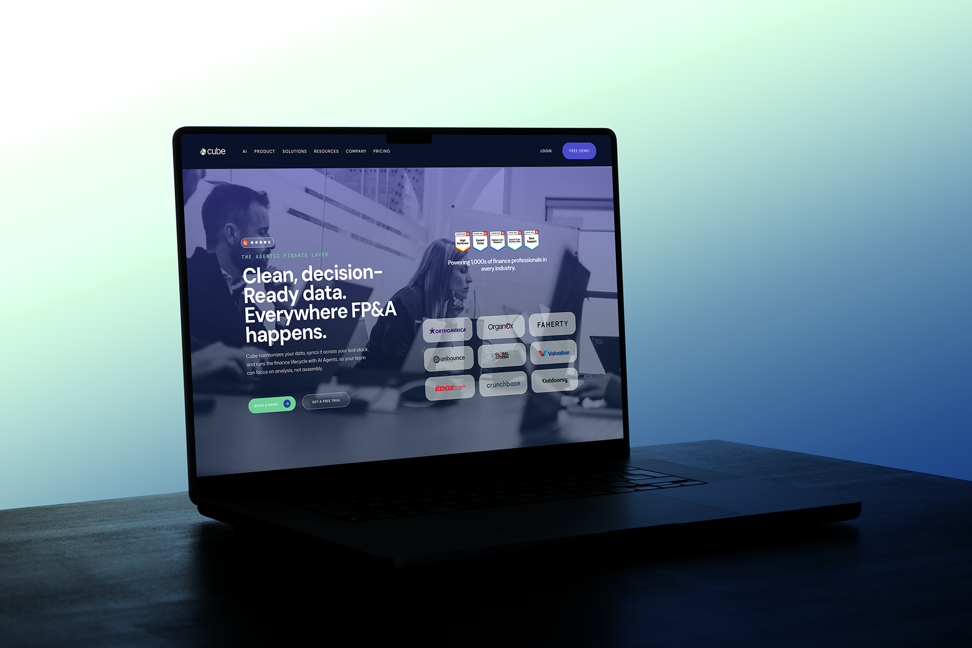
My role focused on working closely with product and marketing teams. I designed across campaign materials, and internal assets. I also contributed to the evolution of Cube’s visual identity, helping refine and modernize the brand across product UI and marketing surfaces to create a more cohesive and confident visual system.
Visit Site
Visit site


Case study
Cube Software

Industry
Location


© 2026 Mahroo Sameen.
As Cube’s sole Brand Designer, I worked on designing across a complex SaaS product used by finance teams for planning, forecasting, and reporting.
My role focused on working closely with product and marketing teams. I designed across campaign materials, and internal assets. I also contributed to the evolution of Cube’s visual identity, helping refine and modernize the brand across product UI and marketing surfaces to create a more cohesive and confident visual system.
Visit Site
Visit site
Case study
Cube Software
Industry
Location

Cube before the rebrand.
Coming in, Cube’s visual identity felt inconsistent and lacked a strong, confident presence in the market. The brand was still evolving and didn’t fully reflect the strength of the product or its positioning within the FP&A space.
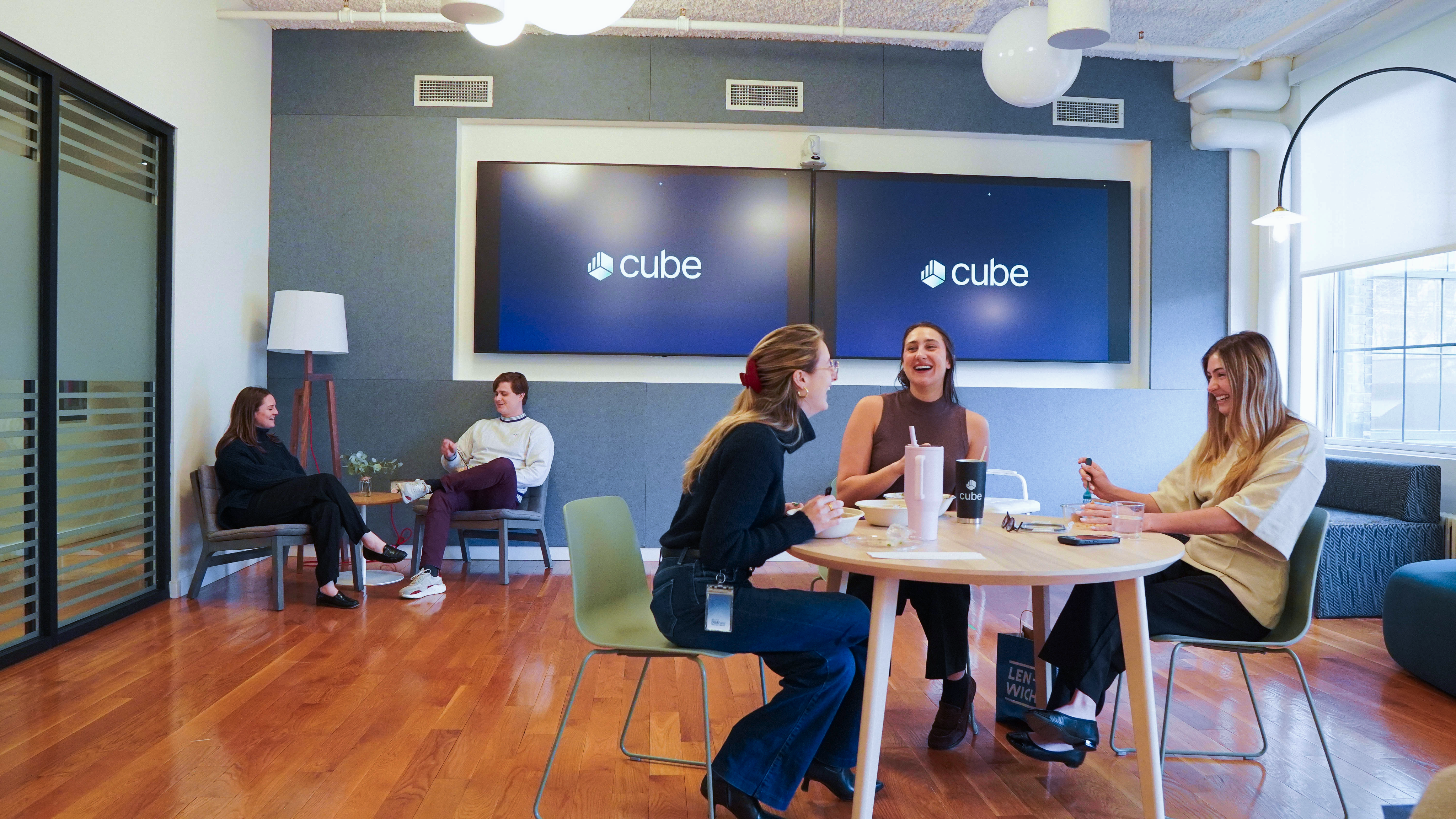
My goal was to help shift the perception toward a more modern, bold, and cohesive visual system, one that felt more intentional and aligned with the product’s capabilities.
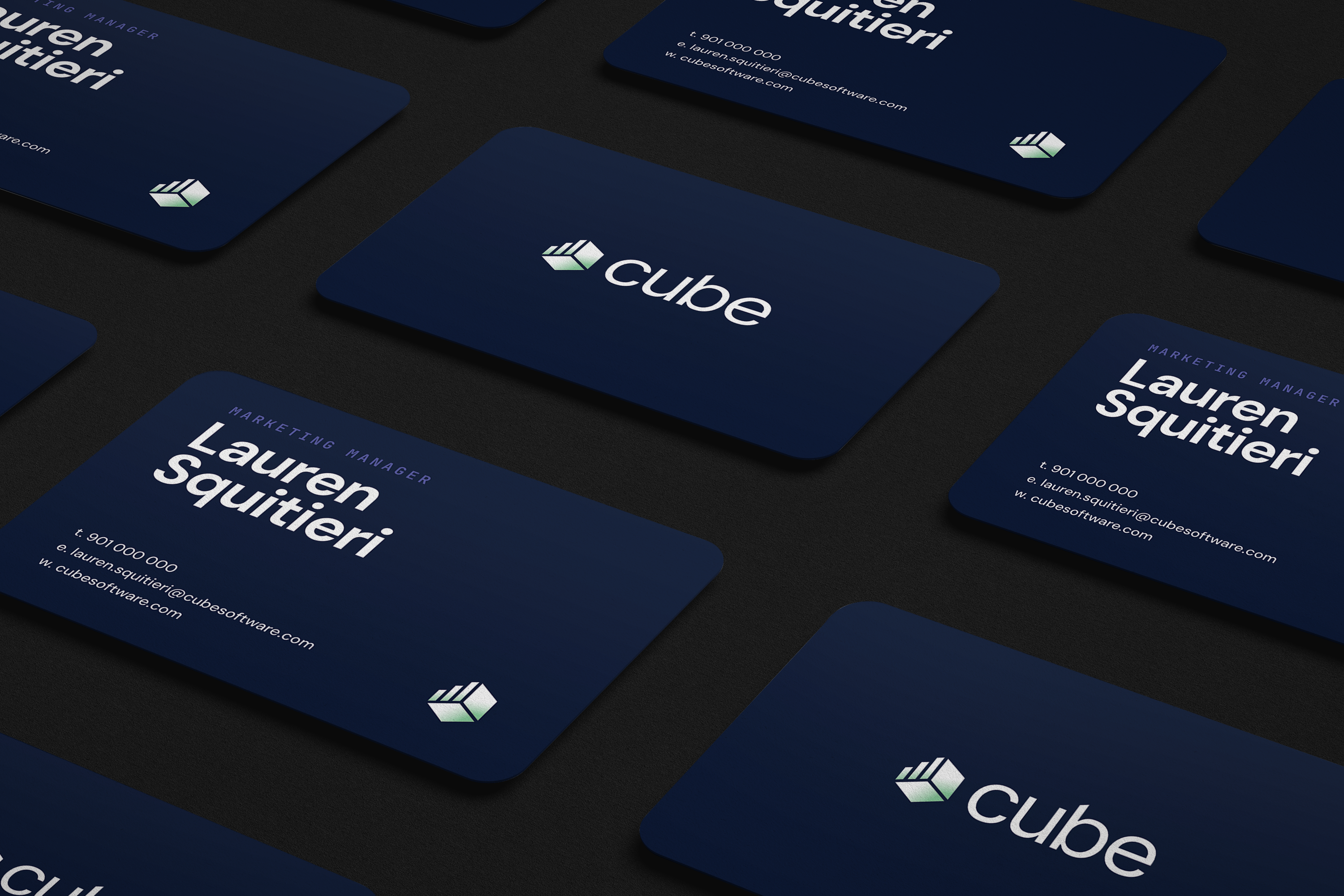
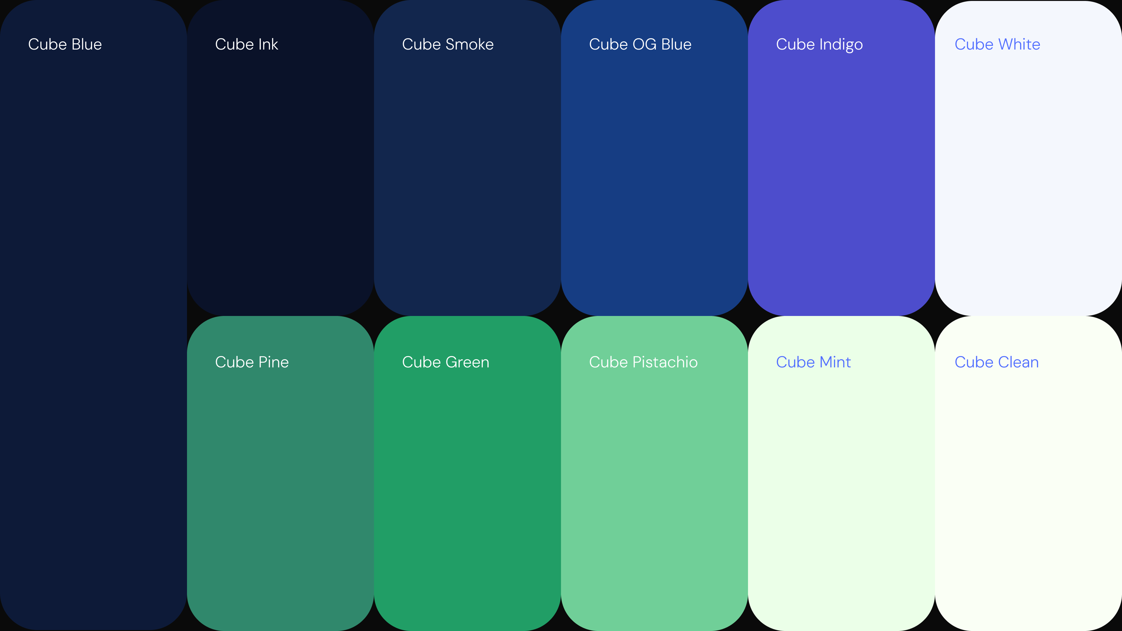
This process involved cleaning up the logo, creating a bolder color palette and type pairing that felt contemporary and sophisticated yet spoke to the finance-techy audience.
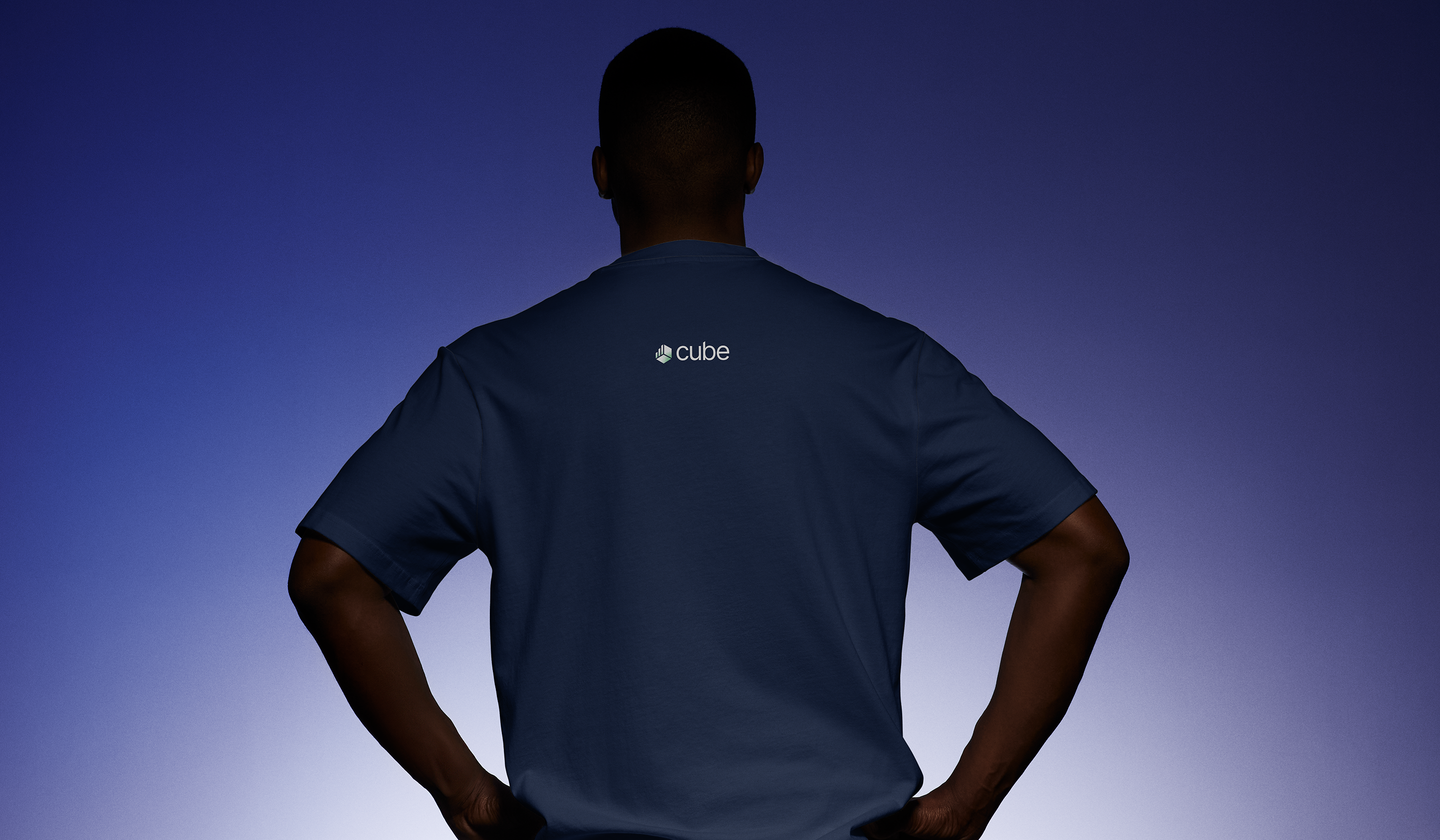
Below are the final deliverables.
© 2026 Mahroo Sameen.
Typography: Oswald and Roboto Condensed
As Cube’s sole Brand Designer, I worked on designing across a complex SaaS product used by finance teams for planning, forecasting, and reporting.
My role focused on working closely with product and marketing teams. I designed across campaign materials, and internal assets. I also contributed to the evolution of Cube’s visual identity, helping refine and modernize the brand across product UI and marketing surfaces to create a more cohesive and confident visual system.
Visit Site
Visit site
Case study
Cube Software
Industry
Location
Cube before the rebrand.
Coming in, Cube’s visual identity felt inconsistent and lacked a strong, confident presence in the market. The brand was still evolving and didn’t fully reflect the strength of the product or its positioning within the FP&A space.
My goal was to help shift the perception toward a more modern, bold, and cohesive visual system, one that felt more intentional and aligned with the product’s capabilities.
This process involved cleaning up the logo, creating a bolder color palette and type pairing that felt contemporary and sophisticated yet spoke to the finance-techy audience.
Below are the final deliverables.
© 2026 Mahroo Sameen.
Typography: Oswald and Roboto Condensed