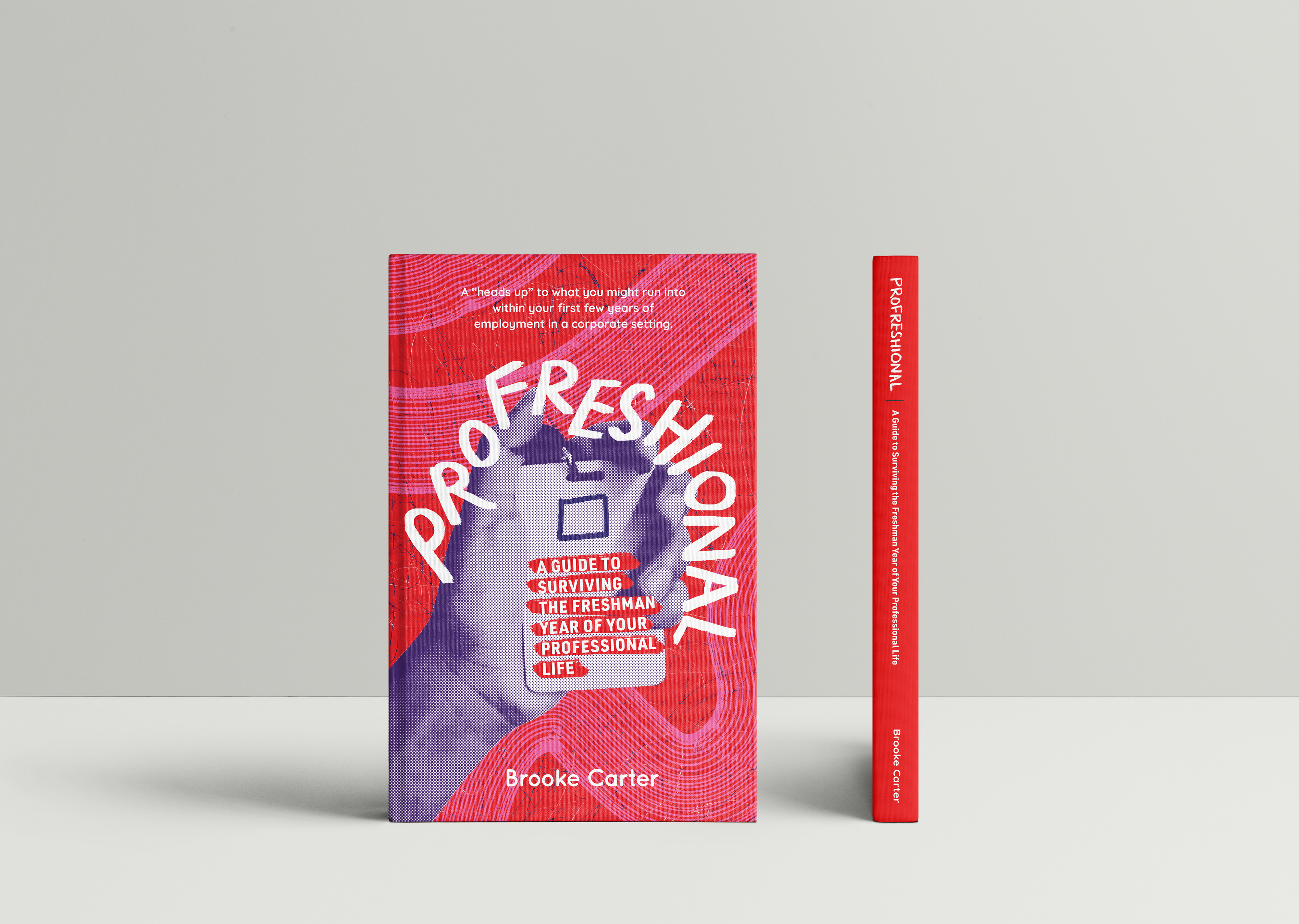
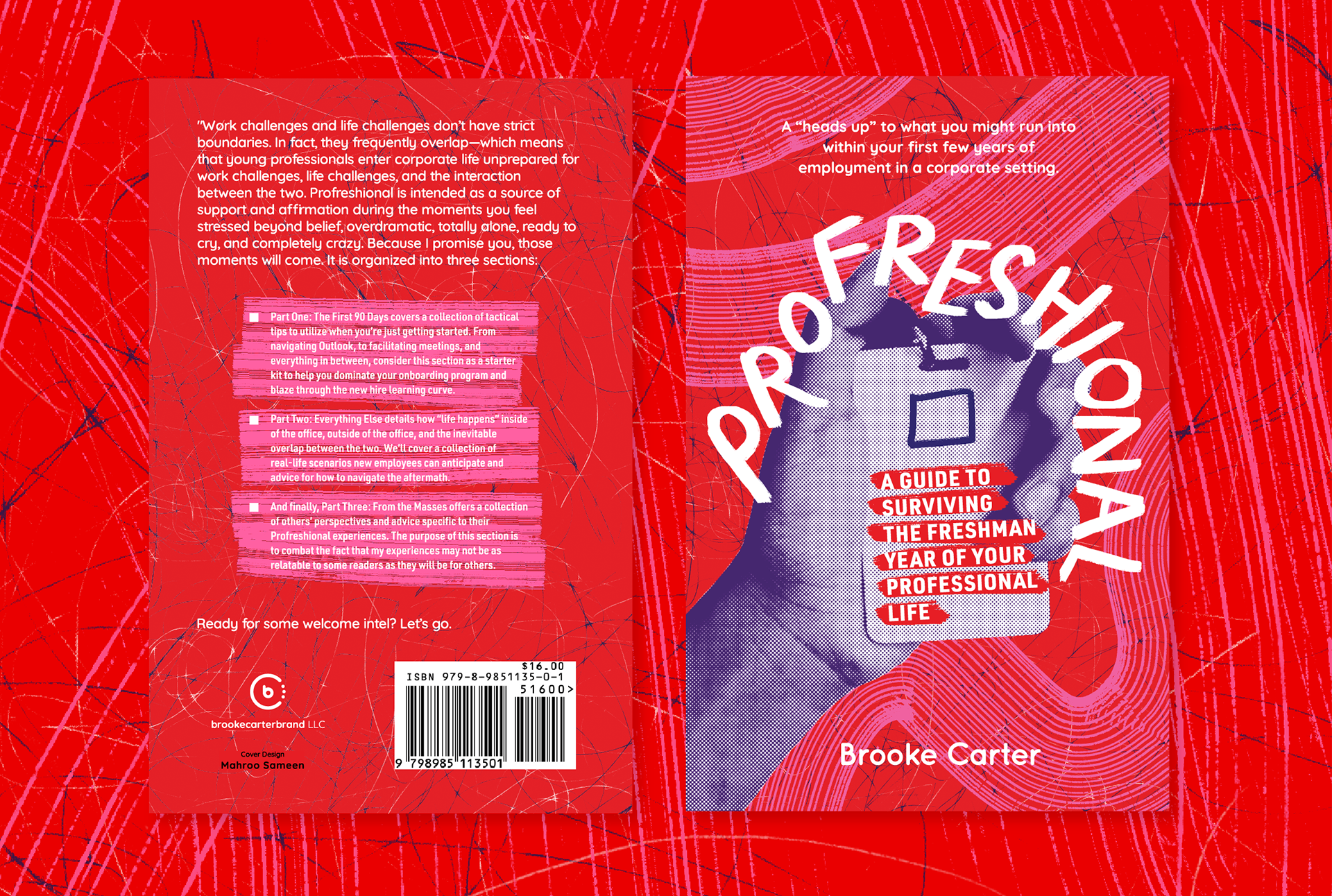
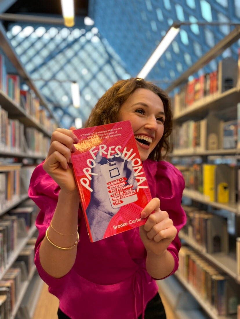
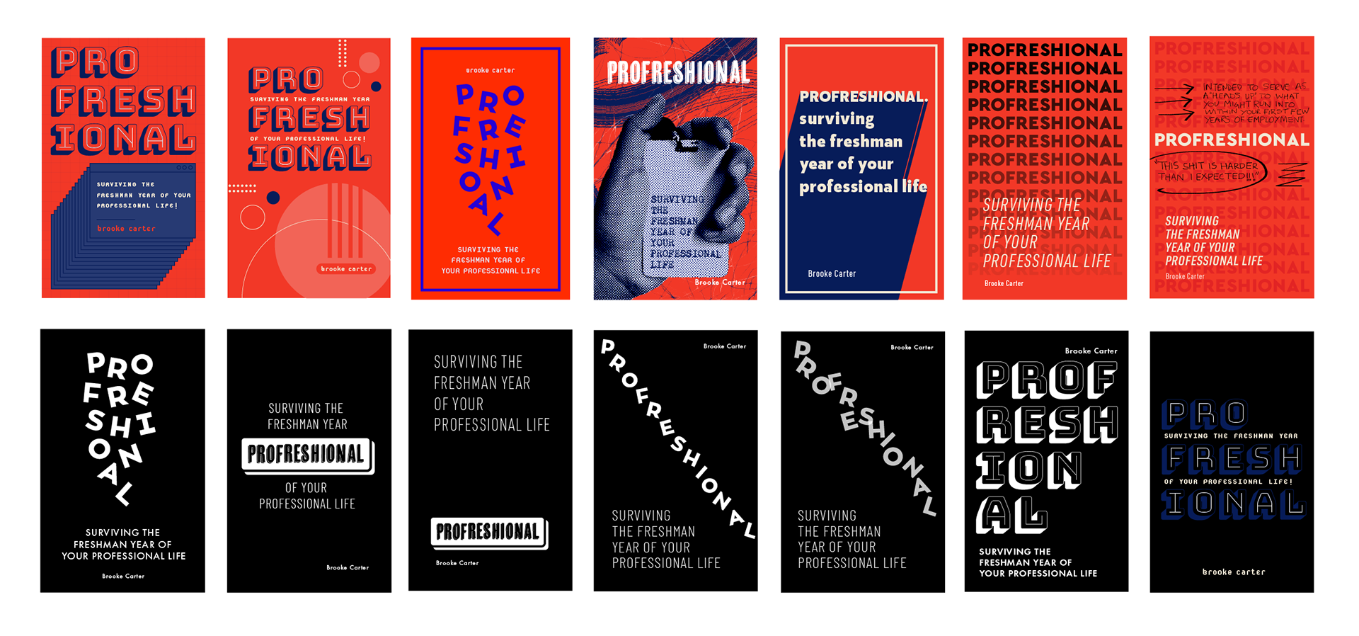
I was asked to conceptualize and bring Brooke's personality to life through her book's cover art. Brooke wrote her first book for young professionals who have just started their careers in the corporate world. The cover needed to reflect the author's undeniably fearless energy and her zest for adventure to her audience. It also needed to stand out from everything that is out there in the self-help category. Hence we landed on this bold and eye-catching cover, to showcase her vibrant story as she navigates through the messes of corporate culture with a feel good attitude.
Click the link to visit Brooke and Profreshional's website!
Process
Together we chose this design direction since it reflects Brooke's colorful personality, the hurdles she's faced and how she's conquered them head high. We selected highly saturated colors, turbulent patterns and bold typography.
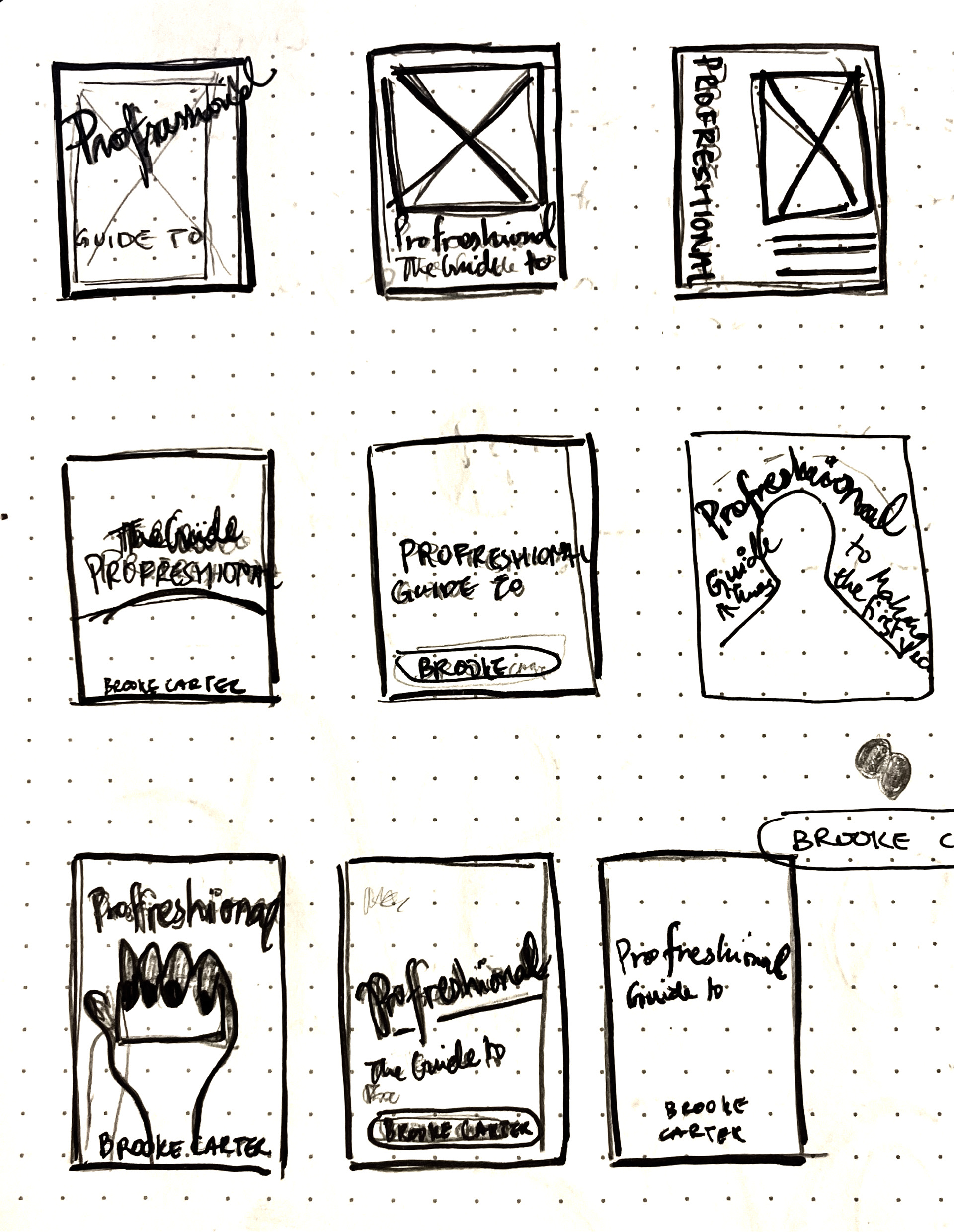
Underneath are some primary covers drafted to spark conversation and hone in on what Brooke really wanted from her cover.
Below is the final logo Brooke chose to represent her LLC and brand. The three circles represent three sides of Brooke. She's a project manager, a writer and a Zumba instructor.


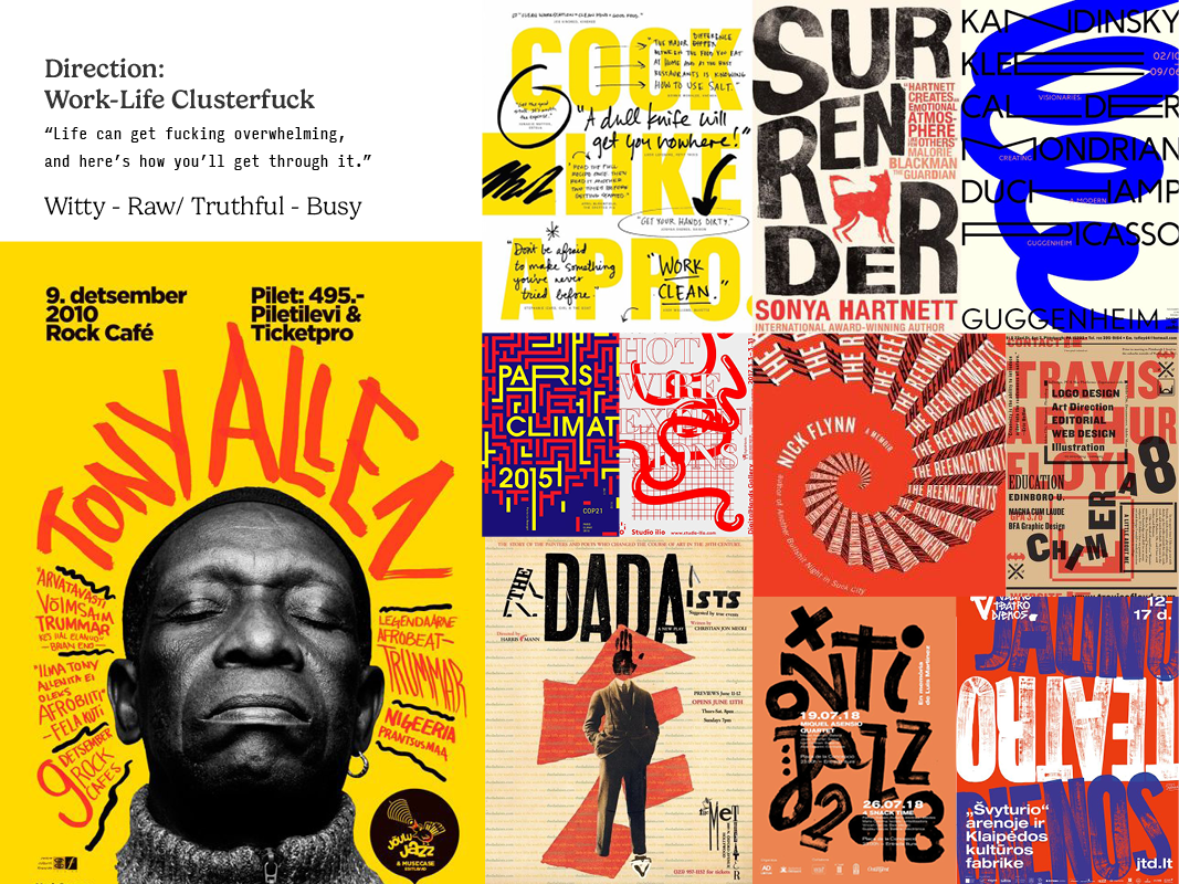
Analyzing the book among digital competitions on search engines .
